Happy Harvest
Harvesting a Brand Identity to Circumvent the Food System for Farm to Table Access.
A Home-Grown Project
Conceptualized by us, EXECUCOMM created Happy Harvest, a community initiative that highlights the essence of local collaboration and sustainable farming. Our mission was to create a visual and strategic identity that resonates with the values of community farmers, education and distributorship, aiming to transform the local food landscape.
The Intentional Rationale
Beyond What Exists
Community Needs & Goals
Sustainable Assessment
Full Brand Roll-Out
About Happy Harvest
Happy Harvest is a pioneering local food collaborative network system designed to connect community farmers with consumers, bypassing the industrial food system. By leveraging education and distributorship mechanisms, Happy Harvest seeks to improve the lifecycle quality for both farmers and consumers, fostering a sustainable and community-centric approach to food production and consumption.
The Wordmarque
We developed a brand mark that captures the spirit of food vitality, collaboration and sustainability. The logo features vibrant approach to traditional primary colours and earth tones, symbolizing growth, nature and diversity. The design incorporates elements of agriculture and community, creating a cohesive and inviting visual identity.
Harvesting Goodness
Cultivating a brand that resonates deeply with community values and sustainability
Creating design elements that articulate the value of healthy, happy eating
Eat Happy
Setting the Tone
Our chosen tagline, “Eat Happy” encapsulates the collaborative spirit of Happy Harvest. It reflects the initiative’s mission to unite farmers and consumers in a shared journey towards a joyous, healthier and more sustainable future. This simple yet powerful phrase became a central element of our branding strategy, resonating with the community’s values.
Unified Growth
The monogram design incorporates a minimalistic version of the original logo, utilizing the first two letters of each word and its signature element the leaf.
Growing Together
Harvesting Together
Eating Together
Nature's Harmony
The use of natural hues and organic shapes in the monogram reflects the harmony between the environment and the community, reinforcing Happy Harvest's commitment to sustainability.
The Unique Dynamism of Collaborative Shapes
Keeping it simple by incorporating recognizable design elements to serve all dimensions and demographics.



Collaborating Consistent Elements
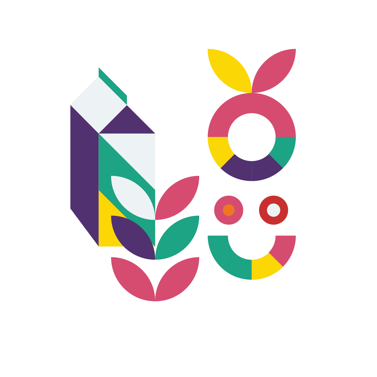
The consistent cohesiveness of design elements for Happy Harvest was characterized by a seamless integration of complementary colours and graphics. We wove its vision into every aspect of the brand, ensuring an across the board and impactful identity that resonates with the community.
Brand Imagery & Visuals
Happy Harvest’s brand imagery focuses on vibrant, community-driven visuals that evoke a sense of connection, community and sustainability. The imagery showcases family, happy environments, local farmers, fresh produce and educational initiatives, painting a vivid picture of the collaborative network.
Growing a Brand Together
Simultaneously blending unique design patterns, colour palettes and happy emotions
Working in unison to collaborate on projects that make a difference and impact
The Many Variations of a Multi-Dimensional Logo
Giving the brand mark full room to be creative in all design spaces and forums.
